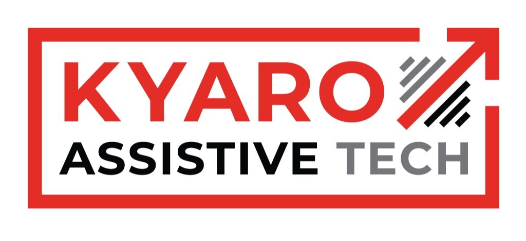
Introducing Kyaro’s New Logo
One of my biggest projects this summer was to redesign our logo. The previous logo included an icon of a person in a wheelchair, which worked when Kyaro’s only products were wheelchairs. However, it’s become misleading since we’ve expanded their inventory to include other assistive devices such as walkers, gait trainers, and splints. We also found that many other assistive device companies and non-profits included a wheelchair icon in their logos. We wanted to develop a logo that was more unique and better communicated how we intend to cover a much wider range of devices than just wheelchairs
After sitting down with the leadership team and discussing their goals for the new logo, we decided on a few key criteria. The new logo should communicate that we’re an assistive tech company, but not include a representation of a specific disability or assistive device. It should appeal to both an American audience and a Tanzanian audience, and therefore shouldn’t include safari animals or other traditional African symbols often used when marketing towards non-Africans. We also wanted the new logo to communicate that Kyaro makes robust and affordable products, rather than boutique or luxury ones. Most importantly, since Kyaro’s customer base is so diverse, the new logo needed to use iconography that people could understand and relate to, regardless of age, gender, education level, disability type, and socio-economic status.
I found this logo redesign to be quite difficult at first. Some of the constraints I had to work with felt contradictory. The logo needed to communicate that we make assistive devices without representing an assistive device. It needed to cater to graduate school educated people as well as people who never attended school. It needed to communicate feelings of trust and reliability but remain neutral enough that a diverse audience could understand and relate to it.
We went through several rounds of iteration, starting with a variety of concepts, and gradually converging on one. Throughout this process, we met frequently to not only discuss feedback but also to formulate Kyaro's brand story. I led several discussions aimed at teasing out the most important "why's” and "how's" of Kyaro's mission, and we eventually were able to formalize Kyaro's identity, making it much easier to decide on the final logo.
The concept we arrived at was an arrow pointing up and to the right, which is meant to represent the user’s journey forward and beyond where they started. In chaga, the language of Colman’s tribe, Kyaro is the word for “journey”, which is why the word "kyaro" is in the same color as the arrow. The dashes around the arrow match the colors of "assistive" and "tech", representing how our user’s journey is supported by the assistive devices we provide them. The dashes also indicate that the arrow is motion—it's not a static symbol, but a dynamic representation of our user’s journey. Lastly, the incomplete box surrounding the entire logo echoes the first part of kyaro's tagline: "breaking boundaries".
It was a pleasure working with Kyaro's team to design their new logo, and I'm excited to see how Kyaros new brand helps them on their mission to reach more people who need assistive devices in Eastern Africa.


